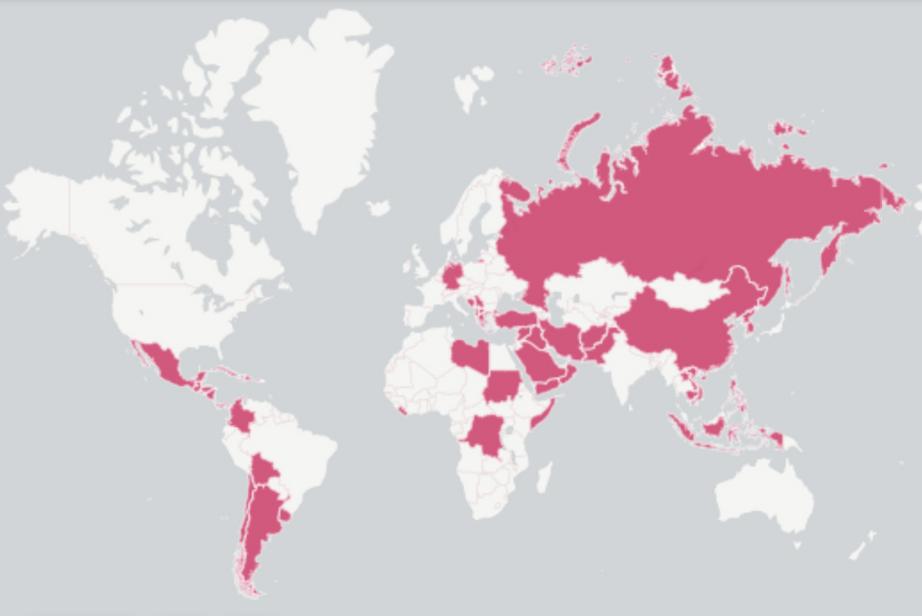
One map with all the countries the US has invaded
... will make you question everything
For those who have ever wanted a clearer picture of the true reach of the United States military — both historically and currently — but shied away due to the sheer volume of research required to find an answer, a crew at the Independent just made things a whole lot simpler.
Using data compiled by a Geography and Native Studies professor from Evergreen State College in Olympia, Washington, the indy100 team created an interactive map of U.S. military incursions outside its own borders from Argentina in 1890 to Syria in 2014.
To avoid confusion, indy100 laid out its prerequisites for what constitutes an invasion:
“Deployment of the military to evacuate American citizens, covert military actions by US intelligence, providing military support to an internal opposition group, providing military support in one side of a conflict, use of the army in drug enforcement actions.”
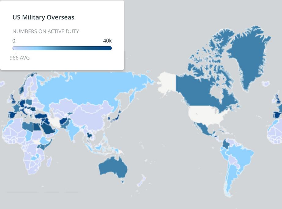
But indy100 didn’t stop there. To put all that history into context, using data from the Department of Defense (DOD), the team also put together a map to display all the countries in which nearly 200,000 active members of the U.S. military are now stationed.

The three countries with the biggest U.S. presence, according to DOD numbers, are Japan at 39,623, Germany at 34,399 and South Korea at 23,297.

The publication of the maps comes just after President Donald Trump announced the military would not be pulling out of its 16-year engagement in Afghanistan — a reversal of his previous stance — and that the U.S. would seek stronger ties with India to combat terrorism in South and Central Asia.
Interactive maps available at source link below.

