Architect transforms cramped NYC apartment with clever space-saving microelements
Fact checked by Haley Mast
A small, less-than-ideal layout is revamped into a bright place to call home.
Living in an apartment in a big city, and being close to all the action that it can offer is something that many people enjoy. With housing prices on the rise—especially for larger, single-family homes out in the suburbs—many are opting to stay in the city by purchasing and remodeling older, and potentially less expensive, apartments. Renovating a dated apartment can be a challenge, however, especially if the layout is irregularly shaped, and lacking in natural light.
But it can be done, and done well, as New York City architect Martin Hopp managed to do with his own residence, a 700-square-foot (65 square meters) garden-level apartment in the Chelsea neighborhood.
Located in a multi-story building dating back to the 1930s, the existing condition of the basement suite was somewhat dark and gloomy, owing in part to the fact that much of the unit is below ground level. As Hopp explains on Dezeen:
"[The apartment's] odd layout and challenging features of exposed foundation walls and large structural columns were further complicated by being partially submerged below grade and hemmed in by foundations. This gave the apartment a subterranean feel that only allowed for brief moments of natural daylight."
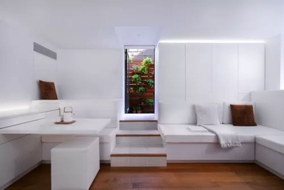
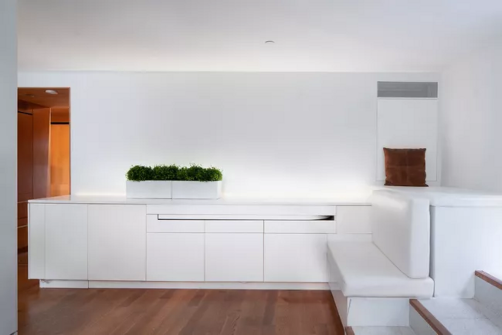
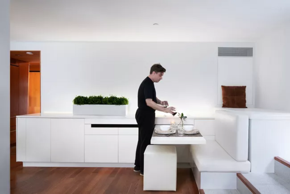
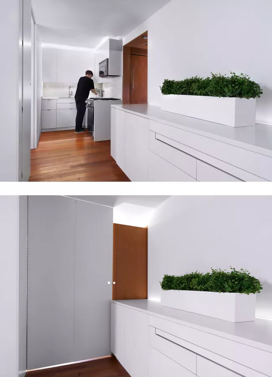
This cave-like feeling was not ideal, so Hopp chose an all-white color palette, bright lighting, and a thoroughly minimalist approach when revamping the interiors. Not surprisingly, this works extremely well, as demonstrated by this vibrant yet cozy multifunctional, L-shaped space that functions as a living room, a working and dining room, and a kitchen.
To make this relatively cramped and rather oddly shaped space work, Hopp designed a series of space-saving "microelements" to increase functionality and maximize the space that was available. Such microelements include a "rotating table" for eating and working, which tucks away into a row of built-in cabinetry that is located along one wall.
There are also a series of customized, built-in seating areas here, with one generous L-shaped, sectional-style sofa running along much of the room, and another tucked away in a nook above the dining area. There is some natural light here thanks to a window, but to provide more ambient light, recessed LED lighting strips have been tucked up near the ceiling and behind the cabinets. To warm up the otherwise all-white space, the floors have been refurbished with the warmer textures of white oak wood flooring.
The compact kitchen is located at one end of the L-shaped space and includes all the basic amenities like a stove, oven, sink, and cabinets for storing food and dishes. The kitchen can be separated off if needed, using a specially designed folding door.
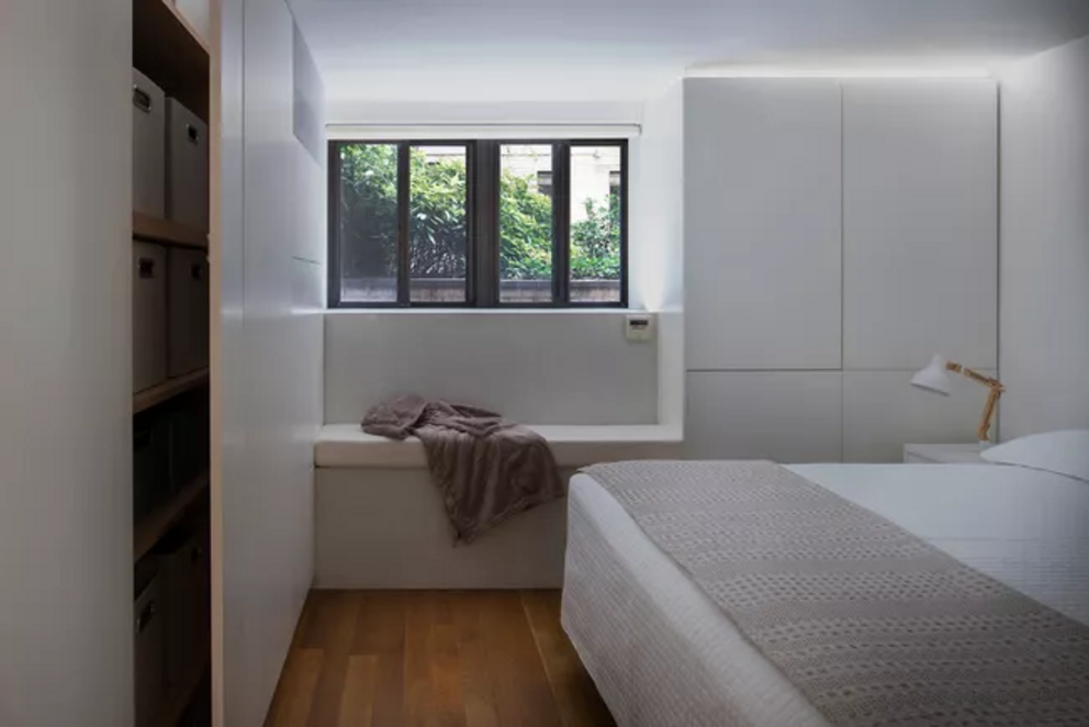
The bedroom is accessed via a door that is located to one side of the kitchen and features much of the same minimalist approach. Every detail has been simplified to give consistent seamlessness and almost impossible airiness to the whole space—from the white wardrobe to the inconspicuous roller blinds hidden above the window, to the fact that the cabinets don't quite meet the ceiling, and are lit with strip lighting—which helps to make the room feel less oppressive.
As Hopp and his team point out:
"Creative lighting strategies work as additional micro-gestures to make the space feel more functional and pleasurable."
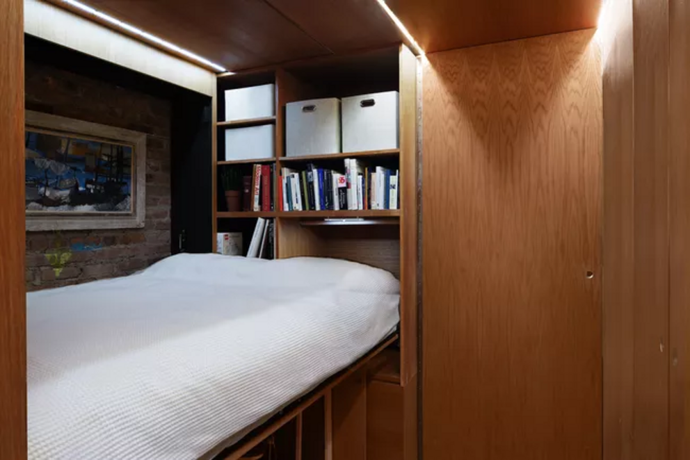
Off to the other side of the kitchen, we have a nice surprise: an office and guest room that was converted out of what used to be a walk-in closet. Lined with white oak, the space now has shelving installed along one wall and a Murphy bed that can fold down when guests stay over.
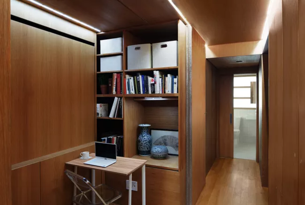
Once again, we have that minimalist line of lighting, and privacy can be found via a big set of doors that can slide out, closing off the space. As Hopp explains:
"A slightly oversized closet was an opportunity to create a multi-functional space that could be guest room, home office and storage area all at the same time. Conceived of pre-COVID, the value of the multi-functional spaces have proven invaluable."
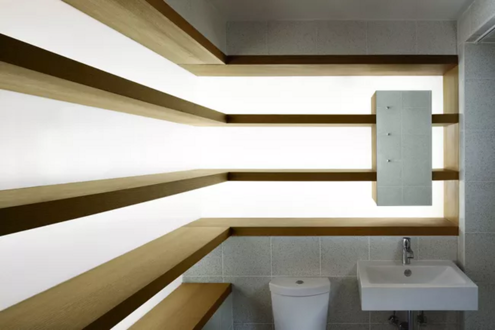
Past the office and down the hall, we come into the bathroom, which includes the rather eye-catching feature of wall shelving that is made with back-lit glass paneling. This customized element was made possible by the discovery of a two-foot deep area behind the walls during demolition and really helps to lighten up an otherwise windowless space.
With the right approach to materials and lighting, this project shows that even a less-than-ideal living space can be transformed successfully into a beautiful home. To see more, visit Martin Hopp.